In this part we’re going to fire up Expression Blend (the trial for version 5 can be found here) and do some UI work.
In part 2, I created a simple Twitter client which connected to the streaming API, and connected to the sampling request which brings back random tweets. Here is the data template:
<DataTemplate x:Key="TweetDataTemplate">
    <Grid DataContext="{Binding}">
        <Grid.RowDefinitions>
            <RowDefinition />
            <RowDefinition Height="Auto" />
        </Grid.RowDefinitions>
        <TextBlock FontFamily="{StaticResource FontFamily}" FontSize="12" Text="{Binding Text}" TextWrapping="Wrap" />
        <TextBlock Grid.Row="1"
                   HorizontalAlignment="Right"
                   VerticalAlignment="Bottom"
                   FontFamily="{StaticResource FontFamily}"
                   FontSize="13.333"
                   Foreground="BlueViolet"
                   Text="{Binding ScreenName}" />
        <TextBlock Grid.Row="1"
                   HorizontalAlignment="Left"
                   VerticalAlignment="Bottom"
                   FontFamily="{StaticResource FontFamily}"
                   FontSize="9.333"
                   Foreground="DarkCyan"
                   Text="{Binding CreatedAt}" />
    </Grid>
</DataTemplate>
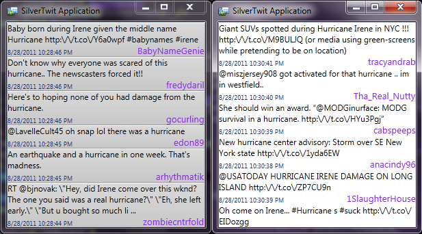
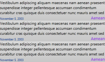
This renders into something like this:
The text is randomly generated from Blend’s sample capability, which is totally awesome as it allows designers to see what they’re working with, and keeps the sample data separate from the real data.
While design is a matter of personal taste, and you’re bound to get disagreements between different people, if you follow some basic rules you’ll satisfy a greater audience.
- Subtle gradients and small shadows
- If you take a look at all the nice interfaces, they tend to use very slight gradients and small shadows. Most of the time you don’t even notice unless you look closely.
- I think Microsoft’s Metro design is beautiful. Reason? It emphasizes text over decorations (like gradients and shadows). This tends to lead to very clean design because there’s very little opportunity to abuse gradients and shadows.
- Realism and light sources
- Continuing on with gradients and shadows, they should be realistic. Look at your design from a 3D point of view. Apply a light source from a certain angle, and then apply your shadows relative to that light source.
- Convey distance properly
- Darker shadows imply being closer to the background, whereas lighter shadows imply being further away. Use blurring to add emphasis to the distance.
- If you overlap planes you should apply these rules to each individual plane. Don’t use the same border for everything. Think about how it would look like in real life if you laid it out like that with pieces of paper. The shadow sizes for that will be different, so you should do the same.
- Also keep in mind that the shadows used above are way too much for any application. Be subtle!
- Consistent theme
- This one seems obvious but nothing is worse than having a nice looking application bring up an unskinned dialog.
- Usability
- If the design doesn’t serve a purpose to make it more usable, it shouldn’t be there. Even something as simple as black on white follows this – you do that so you can read text. However, even something as simple as that can be improved. Take a look at why the Kindle is so successful. The readability is better because of the lower contrast between the black and light-brown background.
With these starting points, let’s redesign the data template.
<DataTemplate x:Key="TweetDataTemplate">
   <Grid>
       <Grid.Background>
           <LinearGradientBrush StartPoint="0.5,0" EndPoint="0.5,1">
               <GradientStop Color="#FFDADADA" />
               <GradientStop Offset="1" Color="#FFC8C8C8" />
           </LinearGradientBrush>
       </Grid.Background>
       <Grid.RowDefinitions>
           <RowDefinition />
           <RowDefinition Height="Auto" />
       </Grid.RowDefinitions>
       <TextBlock FontFamily="{StaticResource FontFamily}" FontSize="12" Text="{Binding Text}" TextWrapping="Wrap" />
       <TextBlock Grid.Row="1"
                  HorizontalAlignment="Right"
                  VerticalAlignment="Bottom"
                  FontFamily="{StaticResource FontFamily}"
                  FontSize="13.333"
                  Foreground="BlueViolet"
                  Text="{Binding ScreenName}" />
       <TextBlock Grid.Row="1"
                  HorizontalAlignment="Left"
                  VerticalAlignment="Bottom"
                  FontFamily="{StaticResource FontFamily}"
                  FontSize="9.333"
                  Foreground="#FF003D8F"
                  Text="{Binding CreatedAt}" />
       <Border Grid.RowSpan="2" BorderBrush="#FF999999" BorderThickness="0,0,0,1" />
       <Border Grid.RowSpan="2" BorderBrush="White" BorderThickness="0,1,0,0" />
   </Grid>
</DataTemplate>
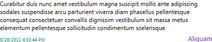
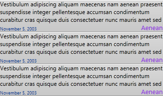
After these changes, it looks like this:
Did you notice the gradient? You might think after seeing it here to adjust the gradients more so you can see it. That would be a mistake. See below.
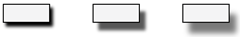
The above is the exact same thing, but stacked vertically three times. When this happens the subtle difference between the top and bottom of the control is more pronounced, so it looks like multiple panels are aligned together.
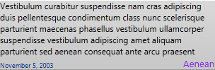
However, there’s still a little touch you can add. The white and gray borders are only 1 pixel high, but that’s the little touch needed to make it look crisp.
Finally, let’s see the before and after (or eh…rather after and before, because I took the screenshot backwards :P):