Back to the UI!
For this post I’m going to restyle the tweets. Recall that they currently look like this:

The gradient background is currently #FFEEEEEE to #FFDDDDDD. For this post I’m going to talk about a very powerful tool in a designer’s arsenal: transparency.
Your first may be to think “big deal”, but just like programmers can use base classes and injection to share common code, designers can use transparency to achieve a similar effect.
Let’s change change the color to be black, and tweak only the alpha. I’m going to set the colors to be #11000000 to #22000000 on a white background. This is the result:

Looks almost identical doesn’t it? However, by doing this we have dramatically improved the reusability of the gradient. Here’s what happens when I change the background to be a different color:

I just changed one variable to do that. If I wanted to provide different themes for my application it would be extremely easy to do that if all the data templates were built with transparencies. In fact, I just slap on a ColorPicker and I’d be done!
Even though it’d be easy to do this, any application that is dominated by one color gets boring very quickly. Most applications that look nice tend to focus around two dominant colors that contrast well against each other. Black and white are very common because they contrast well with a large variety of colors, but you can also have things like blue/green, purple/orange, etc. As always, as long as you’re consistent you’ll likely have a good result.
Now, the flip side of the equation is also possible. This is where you have something that exists already and then you put a transparent layer on top of it, creating a lightening or dimming effect. In my experience I’ve found this to be inferior because it tends to wash out colors. In the example above, if I applied a slightly transparent layer over top of the tweet, my picture and text would be negatively affected. This is nonetheless a very useful trick, like with mouse over effects where you want a quick and cheap way of conveying information to the user.
Now, let’s take a big detour and restyle the entire application and go with a completely different theme. I also wanted try something besides Apple and Microsoft inspired designs, which was more difficult than expected because I guess I’m not as creative as I thought I was :-). Coming up with a good design takes a long time, and frequently you need some sort of inspiration. Twitter in general is a very simple application, so the best designs are simple as well.
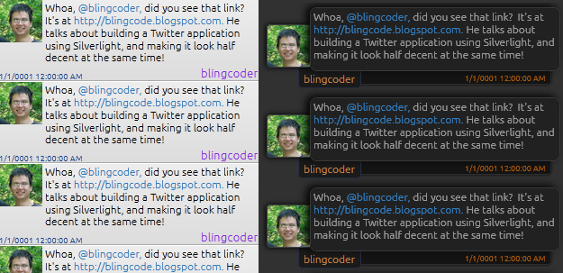
In an attempt to try to come up with something “cool” and “unique”, I started with the idea of elevated boxes layered on top of each other. Here’s a before and after once I was done:

The redesign went through many iterations. I showed it to friends and colleagues and got mixed feelings. Some liked it. Some thought it was too noisy. And herein revealed a problem with complex designs – they are hard to get right! That, and they tend to divide audience into those that really like it, and those that really don’t.
Anyways, the beauty of XAML is that I can try something else entirely without any changes to the code, so I’ll try another theme in the future.
I’m about 90% ready to release code to GitHub along with the first public alpha version. Stay tuned!
